Forecast Center
July/August 2005
by TIM VASQUEZ / www.weathergraphics.com
|
This article is a courtesy copy placed on the author's website for educational purposes as permitted by written agreement with Taylor & Francis. It may not be distributed or reproduced without express written permission of Taylor & Francis. More recent installments of this article may be found at the link which follows. Publisher's Notice: This is a preprint of an article submitted for consideration in Weatherwise © 2005 Copyright Taylor & Francis. Weatherwise magazine is available online at: http://www.informaworld.com/openurl?genre=article&issn=0043-1672&volume=58&issue=4&spage=82. |
PART ONE: The Puzzle
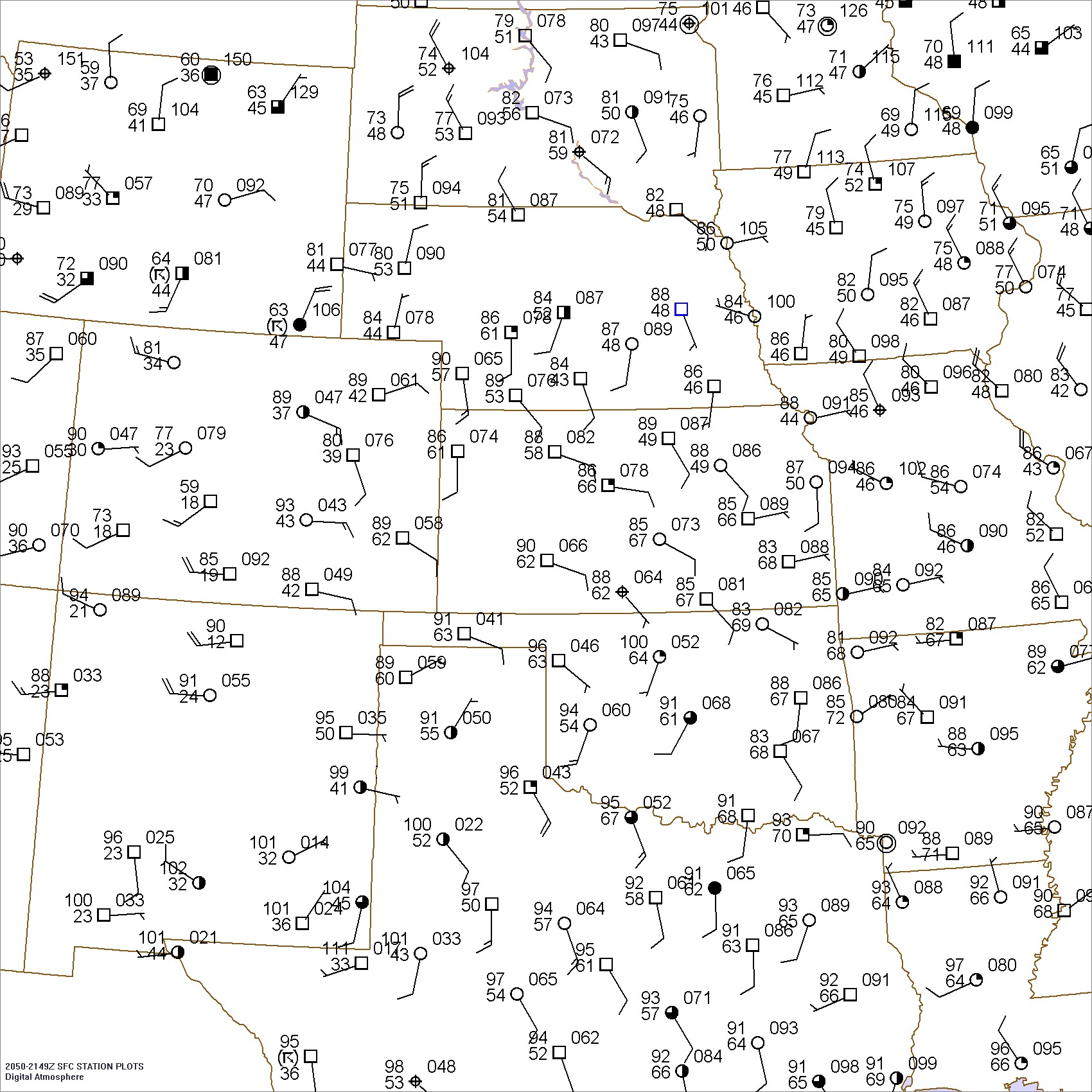
On the afternoon of May 24, 2005, any weather forecaster could have pointed out the unseasonably hot temperatures on the surface chart. However what was not immediately apparent were the fronts and boundaries that would serve as a trigger for scattered storm development. During the winter months, organized precipitation tends to form near massive, well-defined fronts. But during the warm season these important features can become so weak they seem to fade from the charts. These weak boundaries require careful hand analysis, and they're what we'll focus on for this issue. The objective for this puzzle: try to find all the important fronts and boundaries that you can locate.
Draw isobars every two millibars (1004, 1006, 1008, etc.) using the plot model example at the lower right as a guide. As the plot model indicates, the actual millibar value for plotted pressure (xxx) is 10xx.x mb when the number shown is below 500, and 9xx.x when it is more than 500. For instance, 027 represents 1002.7 mb and 892 represents 989.2 mb. Therefore, when one station reports 074 and a nearby one shows 086, the 1008 mb isobar will be found halfway between the stations.
Click to enlarge

* * * * *
Scroll down for the solution
* * * * *
PART TWO: The Solution
There's no need to fear if your chart doesn't look exactly like the one shown here. In the wintertime, weather systems are certainly well-defined and adhere closely to "classical" textbook models. But when patterns are as weak as these, each forecaster's map will look a little different from another. Even the offical National Weather Service map wasn't quite like the solution shown here. While forecasters can debate over whether a feature is actually a front, a trough, or an outflow boundary and where it came from, what is more important is actually finding the features and reaching a consensus on the exact location. This requires close attention to detail, as well as the use of continuity, radar, and satellite imagery.
For example, the near-100 degree temperatures in Oklahoma with south winds contrast greatly with Kansas' mid-80s and easterly winds. A similar difference exists in the Texas Panhandle and in Louisiana. This clearly outlines a front. While a wind shift was found in Arkansas, the contrast was mostly due to a wind direction difference and a trough rather than any strong temperature contrast. This was actually an outflow boundary from morning storm activity. Some readers may have found the South Dakota low and frontal system to be a little easier due to the fresh north winds on the High Plains as well as in Iowa and Minnesota.
The easiest way to keep track of these subtle contrasts is to start with a pencil and sketch marks where strong air mass contrasts are noted. A useful and much more tangible mental exercise is to picture a road trip across part of the map, envisioning the weather in an imaginary car and noting the spot at where a change occurs. These marks and notations eventually form a pattern, and can be joined up to outline fronts, outflow boundaries, and other features. The isobar analysis helps refine these positions further and locates important troughs where winds may converge. Tools such as radar, satellite, and mesonet data can fine-tune the details and uncover other hidden features.
One of the key elements for storm development on this day was the rich moisture working into the higher terrain of southeast Colorado: the station plots show 62-degree dewpoints in this area. High dewpoints are even more ominous at higher elevations because they effectively result in a warmer parcel of air, once lifted and saturated, which more easily breaks the cap that suppresses thunderstorms. Also the easterly winds produced "upslope", which produces lift and further destabilizes the atmosphere. Indeed it was here in southeast Colorado where the best storms developed, feeding off the rich moisture as well as the convergence along the front southeast of Denver. The southern front in New Mexico, in the higher terrain, also produced storms.
Though going the extra mile to find all the fronts, boundaries, and troughs does not produce the prettiest weather charts, the rule is "better safe than sorry" when forecasting thunderstorms. Very weak features can become extremely important wherever the cap is weak and sufficient moisture is present. Keeping track of them, however, keeps forecasters on top of the game. Still, it's a tough job; every year many tornadic outbreaks begin along boundaries that are so subtle that they barely show up on the surface charts. Forecasters have to use all the tools that are available.
When winter is gone and strong cold fronts fade from the map, it might seem that it's time to put away the colored pencils and wait for the march of cold fronts in October. But the reverse is true: during the warm season, hand analysis becomes more important than ever.

Click to enlarge
©2005 Taylor & Francis
All rights reserved