Forecast Center
May/June 2010
by TIM VASQUEZ / www.weathergraphics.com
|
This article is a courtesy copy placed on the author's website for educational purposes as permitted by written agreement with Taylor & Francis. It may not be distributed or reproduced without express written permission of Taylor & Francis. More recent installments of this article may be found at the link which follows. Publisher's Notice: This is a preprint of an article submitted for consideration in Weatherwise © 2010 Copyright Taylor & Francis. Weatherwise magazine is available online at: http://www.informaworld.com/openurl?genre=article&issn=0043-1672&volume=63&issue=3&spage=94. |
PART ONE: The Puzzle
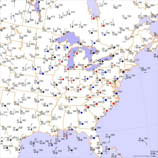
The winter of 2009-2010 was destined to be one of the snowiest in the northeast United States since climate records began, and the snow events continued well into the month of February. So what does a snowstorm look like on the weather charts? In this issue we take a look at one such example.
This weather map depicts an early evening weather situation in February. Draw isobars every four millibars (996, 1000, 1004 mb, etc) using the plot model example at the lower right as a guide. As the plot model indicates, the actual millibar value for plotted pressure (xxx) is 10xx.x mb when the number shown is below 500, and 9xx.x when it is more than 500. For instance, 027 represents 1002.7 mb and 892 represents 989.2 mb. Therefore, when one station reports 074 and a nearby one shows 086, the 1008 mb isobar will be found halfway between the stations. Then try to find the locations of fronts, highs, and lows.

Click to enlarge

* * * * *
Scroll down for the solution
* * * * *
PART TWO: The Solution
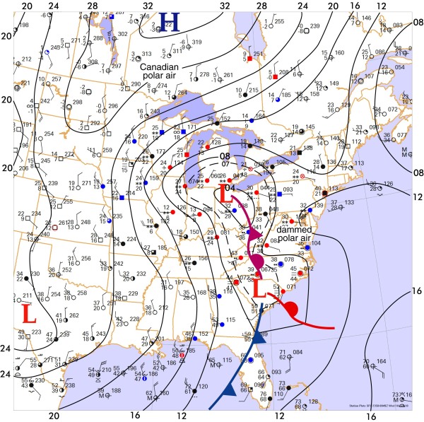
Just days after a snowstorm crippled the Washington D.C. area with 32 inches of snow, yet another winter storm moved eastward across the Appalachians on the evening of February 9, 2010, as depicted here. Referred to as "Snowmageddon Part II" by media pundits, this second punch of winter weather was not quite as powerful, but was strong enough to shut down federal government offices in the Washington, D.C. area. It prompted Continental Airlines to delay over 400 flights out of Newark Airport and snarled midweek Amtrak schedules. Forecasters warned that this storm would ultimately bring an additional 12 inches of snowfall to the Northeast corridor.
The weather analysis showed that polar air was entrenched across much of the northern Atlantic Seaboard, a prerequisite for significant snows in the northeast. Quite often in Virginia and the Carolinas this polar air is "dammed" against the Appalachians, unable to flow westward and circulate into the low. This retards the erosion of cold air and keeps it in place, checking the northward movement of the warm front and broadening the effect of winter weather. On this map, the pressure reading of 1008 mb in central Virginia and the cold conditions present there reflect the damming of this polar air in advance of the winter storm. The small-scale ridge of high pressure shown in that area is a common feature and remains in place until the system passes.
Two moderately strong low pressure areas were located with the strongest over Ohio. In this example we decided to add an intermediate isobar of 1007 mb. Intermediate isobars are often added by analysts to help highlight subtle features, and any value may be selected in order to draw out more detail on the weather chart. Here, the 1007 mb isobar was useful in isolating an area of low pressure in South Carolina.
The tropical air was primarily confined to Florida and adjacent Atlantic waters, where temperatures were in the 60s and 70s with rich dewpoint readings in the 60s. Since this tongue of tropical air, at the surface, does not extend any further north than South Carolina, the actual position of cold fronts and warm fronts are confined only to those locations southward, while the frontal boundary from the Carolinas northward is manifested by an occluded front, implying that the warm air is found aloft along its axis. Likewise, the low pressure area in South Carolina is a "baroclinic" low, fueled by the strong temperature contrasts between polar and tropical air, while the low in Ohio is detached from the tropical air and is a barotropic low, a decaying frontal low that is moving northeastward. It is unable to tap the strong thermal contrasts and intensify. However it is still coupled with the upper-level low and is capable of producing clouds, weather, and precipitation.
What does this mean in terms of snowfall? In terms of energy, all eyes are focused on the baroclinic low in South Carolina, since the strong thermal contrasts here are by far the most significant. Over the next 24 hours, this low moved up the Atlantic Coast and became the main weather highlight. A big snowmaking process is the strong warm air advection on the east side of this low, funnelling tropical air northward over the surface-based polar air. This produces a type of low-level lift known as isentropic lift, the so-called "overrunning" effect. At the time of this map, much of this isentropic lift centers on North Carolina and Virginia, producing the rain and snow depicted here.
As the low deepened further, the flow of warm, moist air intensified, strengthening the isentropic lift north and northeast of the surface low as it moved up the coast. The strongest activity was just offshore, sparing the northeast U.S. from an disastrous assault of snow and ice, but if these Atlantic systems are deep enough or graze the coast more closely, the events can easily generate record-setting snow along the coast, as with the "Storm of the Century" of March 13, 1993.
Computers do not produce the puzzle solution. The weather chart is created automatically with Digital Atmosphere, but fronts and isobars are added by hand using Adobe Illustrator.

Click to enlarge
©2010 Taylor & Francis
All rights reserved