Forecast Center
July/August 2010
by TIM VASQUEZ / www.weathergraphics.com
|
This article is a courtesy copy placed on the author's website for educational purposes as permitted by written agreement with Taylor & Francis. It may not be distributed or reproduced without express written permission of Taylor & Francis. More recent installments of this article may be found at the link which follows. Publisher's Notice: This is a preprint of an article submitted for consideration in Weatherwise © 2010 Copyright Taylor & Francis. Weatherwise magazine is available online at: http://www.informaworld.com/openurl?genre=article&issn=0043-1672&volume=63&issue=4&spage=66. |
PART ONE: The Puzzle
When a powerful weather system brings warm, moist low-level air and cold upper-level air together, the stage is set for some of the most violent weather on the planet. This configuration was recognized over 120 years ago when expert John P. Finley conducted the first detailed tornado study for the U.S. Army Signal Service, a predecessor to today's National Weather Service. In this issue's puzzle we'll take a special look at one of the most potent weather systems to ever strike the United States.
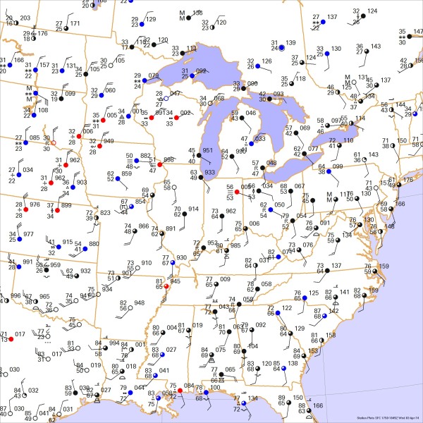
This weather map depicts a midday weather situation in April. Draw isobars every four millibars (996, 1000, 1004 mb, etc) using the plot model example at the lower right as a guide. As the plot model indicates, the actual millibar value for plotted pressure (xxx) is 10xx.x mb when the number shown is below 500, and 9xx.x when it is more than 500. For instance, 027 represents 1002.7 mb and 892 represents 989.2 mb. Therefore, when one station reports 074 and a nearby one shows 086, the 1008 mb isobar will be found halfway between the stations. Then try to find the locations of fronts, highs, and lows.

Click to enlarge

* * * * *
Scroll down for the solution
* * * * *
PART TWO: The Solution
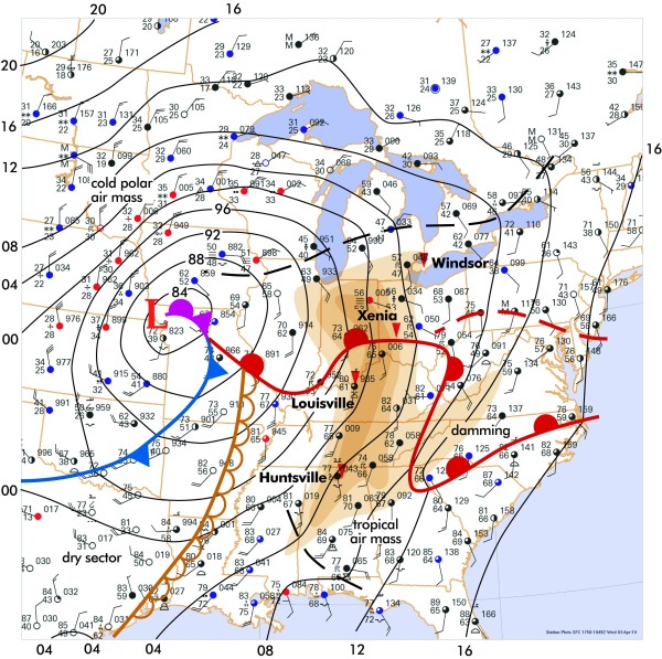
This weather map shows the conditions at 2 pm Eastern Time on April 3, 1974. On this date a swarm of 148 tornadoes descended on Ohio, Indiana, Kentucky, Tennessee, Alabama, and a number of adjoining states. The tornado area is depicted here by brown shading with the most damaging tornadoes marked by red triangles. The twisters killed over 300, injured several thousand, and caused a damage toll of nearly $4 billion (adjusted to 2010). This made it the biggest one-day tornado outbreak in recorded history and the deadliest U.S. outbreak in modern times.
The analysis showed a deep low pressure area in near Kansas City, measuring 982 mb. This is a classic cold-season Great Plains cyclone. The broad cyclonic circulation around this low pressure area reached into the Gulf of Mexico and brought this tropical air northward. The 70-degree isotherm reached as far north as Buffalo, New York, with 80s across much of Kentucky.
Although a quick glance at the map shows that a front is somewhere between the bitter north winds in the Dakotas and the sultry conditions in Kentucky, the powerful spiral of the low pressure area has brought one surprise ingredient into play: the Great Plains dryline. This stretches from St. Louis, Missouri southward to Houston, Texas. It is easily located where the rich 70s dewpoints, cloudy conditions, and southerly winds in the Deep South sharply change to 50s dewpoints, clear skies, and west winds in the dry sector. The dry sector is caused by dry desert air originating from Mexico and the Southwest U.S., but its eastern edge along the dryline is enhanced by the vertical "mixing out" of shallow moist air into higher levels of the atmosphere due to solar heating. In some cases the dry air is enhanced where upper-level sinking, or subsidence, in the wake of the low pressure system forces dry air to the surface.
Once the dryline is located, it is fairly easy to find the fronts. The cardinal rule of thumb for frontal placement is that fronts are found on the warm side of a zone of temperature contrast. For example, we can find a temperature contrast zone between the far north and the far south portions of Indiana. The rule about placing the front on the warm side dictates we place the front in southern Indiana. Forecasters may use wind shift lines, pressure troughs, and other gradients to serve as a frontal position as long it doesn't violate the cardinal rule: the front must occupy the warm side of a zone of temperature contrast.
The exact placement of the warm front is certainly a challenge, especially in the Appalachian region. One possible placement is shown by the dashed red line in Pennsylvania. However, careful study of the map reveals another temperature gradient in the Carolinas. This is a classic "damming" configuration, discussed in last issue's Forecast Center. It occurs when the surface low approaches stagnant polar air in the Piedmont region, which in turn is blocked by the Appalachians. This causes an area where the warm front lags in its northward retreat and results in the characteristic kink shown here.
So how does this map explain the 1974 Superoutbreak? Unfortunately, surface data only tells us what's happening at the bottom fringe of an 8-mile deep ocean of tropospheric air. A forecaster needs the full set of upper-level charts and thermodynamic soundings to understand why April 3, 1974 was so favorable for tornadoes. But while the surface chart can't solve the puzzle, it does reveal several of the most important elements. It's clear that a strong surge of moist, warm, southerly air is rapidly spreading northward into the eastern United States. Dewpoint values are in the mid-60s as far north as Kentucky, and from a climatological standpoint such readings are quite conducive to severe weather in these regions in April. The highest values of dewpoint temperature, especially where they correlate with the thickest cloud layers (suggested by the overcast station plots), gives an excellent outline of the best available fuel for severe storms.
The storms are most likely to develop where the best lift is found. On these surface charts, the best lift is identified by boundaries and localized areas of convergence, where winds come together. The warm front depicted here is indeed a boundary, and the sharp change in winds across the front in Indiana and Ohio suggests enhanced convergence. So Indiana and Ohio yield the prime location for both fuel and lift, marking the main threat area. Other storms did indeed form further south in Kentucky and Tennessee, but here we have arguably reached the limit of what this map tells us, and a forecaster would have to turn to radar, satellite, fine-scale surface data, and trends to get the full picture on where the boundaries and convergence features are located.
In many cases, severe storms develop not near the moisture axis but at the western periphery of the moisture field, i.e. along the dryline. Indeed, this map suggests a good chance for severe weather along the Mississippi River, with Memphis and St. Louis at risk for strong storms. However, deep, powerful cyclones like the one shown here tend to rapidly erode the westernmost fringes of the tropical air mass, resulting in poor moisture depth. Not surprisingly, nearly all thunderstorm activity on this date remained well to the east.
Computers do not produce the puzzle solution. The weather chart is created automatically with Digital Atmosphere, but fronts and isobars are added by hand using Adobe Illustrator. Raw weather observations for the 1974 Superoutbreak were obtained from the Weather Graphics Surface Archives dataset.

Click to enlarge
©2010 Taylor & Francis
All rights reserved