Forecast Center
November/December 2007
by TIM VASQUEZ / www.weathergraphics.com
|
This article is a courtesy copy placed on the author's website for educational purposes as permitted by written agreement with Taylor & Francis. It may not be distributed or reproduced without express written permission of Taylor & Francis. More recent installments of this article may be found at the link which follows. Publisher's Notice: This is a preprint of an article submitted for consideration in Weatherwise © 2007 Copyright Taylor & Francis. Weatherwise magazine is available online at: http://www.informaworld.com/openurl?genre=article&issn=0043-1672&volume=60&issue=6&spage=82. |
PART ONE: The Puzzle
In this issue, Forecast Center goes "down under" to the Australian continent. Coriolis term is reversed, meaning high pressure areas spin counterclockwise and lows spin clockwise. Following international convention, the wind barbs are plotted in mirror fashion in the Southern Hemisphere. Can you locate the air masses and fronts? Fortunately it's not so confusing if you start with the basics. Drawing the isobars, then study the air masses station by station. And remember Buys-Ballot's law is reversed. With the wind at your back, low pressure is on the right.
This weather map is for the afternoon hours in September. Draw isobars every four millibars (1008, 1004, 1000, 996, etc.) using the plot model example at the lower right as a guide. As the plot model indicates, the actual millibar value for plotted pressure (xxx) is 10xx.x mb when the number shown is below 500, and 9xx.x when it is more than 500. For instance, 027 represents 1002.7 mb and 892 represents 989.2 mb. Therefore, when one station reports 074 and a nearby one shows 086, the 1008 mb isobar will be found halfway between the stations. Then try to find the locations of fronts, highs, and lows.
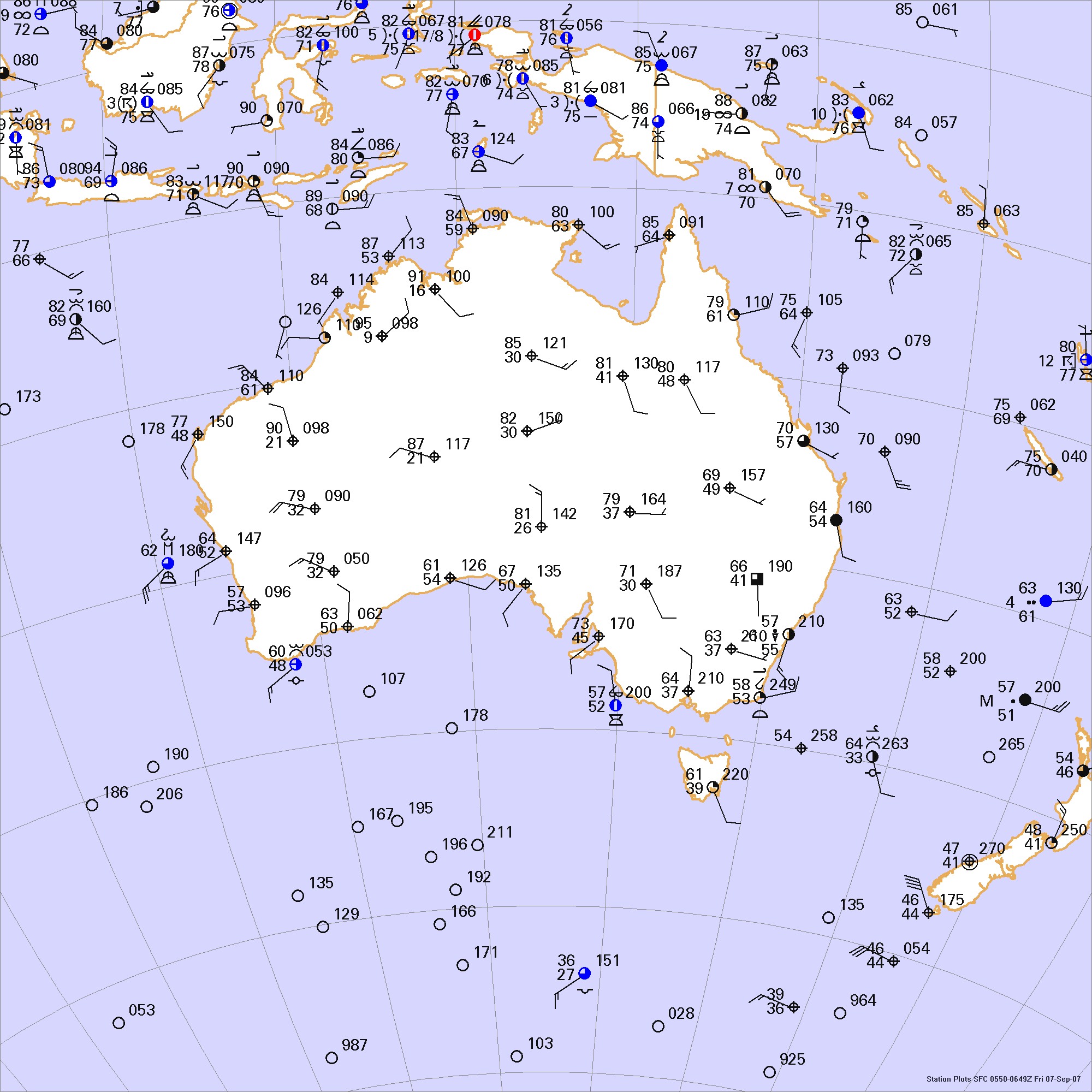
Click to enlarge

* * * * *
Scroll down for the solution
* * * * *
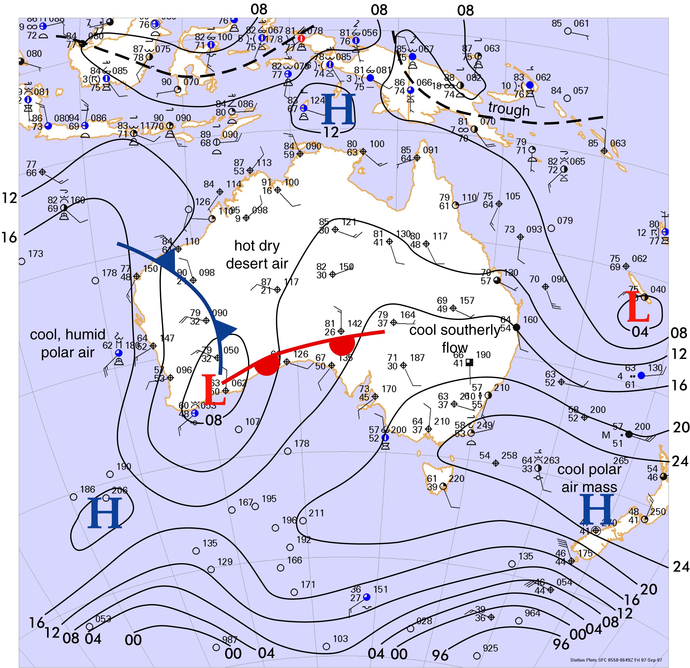
PART TWO: The Solution
The afternoon of September 7, 2007 was mild throughout the Australian Commonwealth, with warm temperatures in the deserts and cool readings in the southern cities. Being the month of September, Australia was entering its spring months, yielding the equivalent of what meteorologists might see on March 7 in the United States.
The most prominent weather system was the low pressure area on the southwest coast of Australia. It was moving from west to east, following the prevailing westerlies, with a cold air mass trailing in its wake entering western Australia. Not surprisingly, this was a dry front with no precipitation. The reason for this is the extremely dry desert air in the Australian interior, where dewpoints were only in the 20s and 30s. Even the towns adjacent to the tropical ocean waters along the northern coast experienced a bone-dry air mass, comparable to a June afternoon in New Mexico.
Further south near the Great Australian Bight was a weakly defined warm front. In fact it was so weak that the solution presented here is strictly a suggestion. Your location of the warm front may differ. Any forecaster tracking this system would have had to scrutinize trends in the surface map, examine satellite data, and look at secondary sources of weather data in order to properly fine-tune the location of this weak front.
Since there are very few land masses in the temperate southern hemisphere with only one significant mountain range, southern latitudes do not have the strong, unequal heating mechanisms and sharp south-north heat transport that the northern hemisphere does. The weather patterns tend to be less complicated and larger in scale. However forecasting can be a tremendous challenge due to very large data voids in the oceans. Forecasts were very unreliable along the western coasts of South America and Australia until the 1960s with the advent of satellite data and global dynamical models. Even the global models are not entirely accurate, as they are not seeded with enough useful observations in the southern oceanic regions.
If you have become accustomed to looking at weather charts in the United States and Canada, this exercise will expose you to an interesting dichotomy in how the brain visualizes weather charts. By studying the Australian chart carefully and being cognizant of the reversed Coriolis effect, it is easy to grasp the mechanics of what is happening. It could be said that the left side of your brain understands this basic analysis, and sees how the air masses are moving. However, you will find that your pattern recognition skills are completely blank, as the patterns are unfamiliar and you have no meteorological intuition and experience in the southern hemishere.
However try holding the weather chart up to a mirror and view the reflection. This mimics what the same weather patterns would look like if they were occurring in the northern hemisphere. Almost immediately you will find yourself synthesizing the analysis with your past experience in the United States and Canada! In a similar manner, weather charts and satellite images viewed on the Internet can be loaded into paint programs and mirror-imaged. This technique can be a very helpful method for getting a quick grasp on weather systems in an unfamiliar hemisphere, though it is debatable whether the technique is more of a tool or a crutch.
Also when working in a different hemisphere, you can obtain a familiar meteorological date by adding six months to the analysis date. This gives the meteorological season for your hemisphere that corresponds to the chart you are analyzing. For example, a chart for South Africa on February 3 would have roughly the same solar angles and radiation balance as that on August 3 in the northern hemisphere.
Computer programs do not produce the Forecast Center solutions. All fronts and isobars are drawn by hand using illustration software.
Click to enlarge
©2007 Taylor & Francis
All rights reserved